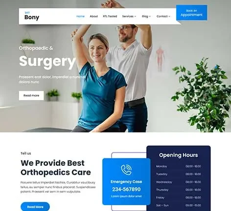
SKT Mobile-Friendly | Mobile Compatible WordPress Theme
For $41.00
For Documentation: Click Here
Mobile Compatible WordPress Theme
Today, mobile users are the main audience for websites, and those that haven’t adapted to this trend have experienced a loss in visibility, engagement, and trust.
Mobile compatible WordPress theme specifically created to be mobile compatible, ensuring a smooth and seamless experience on tablets, smartphones, and desktops.
Rather than forcing a layout to fit desktops awkwardly, this theme uses a mobile-first design. This approach ensures fast loading, clear content, and easy navigation on all screen sizes. Whether you manage a blog, a business website, a service site, or a portfolio, this theme ensures your site remains accessible at all times.
How This Theme Enhances User Experience as a Mobile Compatible WordPress Theme?
Having a mobile-friendly website is no longer optional—it’s essential.
A mobile compatible WordPress theme ensures users have a consistent experience, no matter the device, browser, or other factors.
The layout automatically adjusts, touch interactions feel natural, and key information is always visible without requiring horizontal scrolling or zooming.
This leads to increased user engagement, lower bounce rates, and a more positive overall experience.
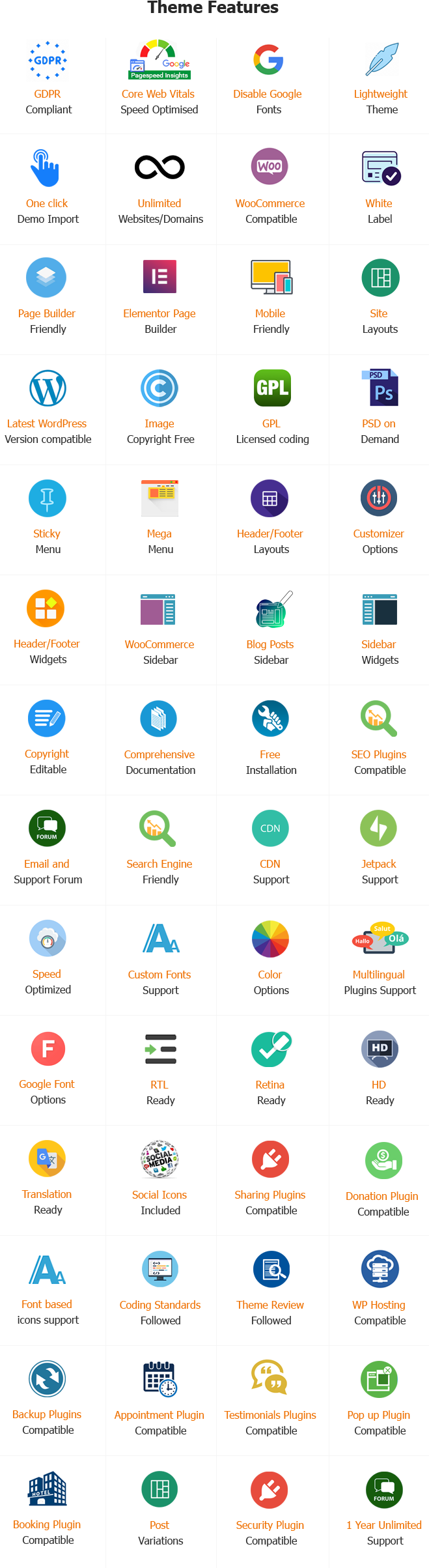
Features of the Mobile Compatible WordPress Theme
1.Responsive Layout
The layout adapts to the user’s device, automatically resizing images, content blocks, and typography without affecting the design.
2.Mobile-First Design Approach
The WP theme is built with smaller screens in mind, ensuring clarity and usability on smartphones, and then expands to larger screens.
3.User-Friendly Navigation Menu
Menus, buttons, and links are spaced for easy tapping, minimizing accidental clicks.
4.Fast Mobile Page Loading
The optimized structure reduces loading times on mobile, enhancing user engagement and performance.
5.Adjustable Typography Scale
Text can be easily adjusted on the device, ensuring readability without the need for manual zooming.
6.Flexible Footer and Header Behavior
Footers and headers are organized neatly to avoid clutter and simplify navigation.
7.Image Optimization for Smartphones
Images are scaled down proportionally and load quickly while maintaining quality without slowing the page.
8.Cross-Device Browser Compatibility
The theme displays consistently across mobile and desktop browsers, including Chrome, Safari, and Firefox.
9.SEO-Friendly Mobile Structure
Clean HTML and a responsive layout help improve rankings with mobile-first indexing.
10.Simple and Easy to Code
Avoids heavy scripts that can slow mobile performance.
11.Contact Readiness and Click-to-Call
Mobile-friendly contact actions encourage more lead generation.
12.Scroll-Friendly Content Sections
Smooth vertical scrolling is designed for ease of use on mobile devices.
13.Optimized Layout for Tablets
The layout remains balanced and well-spaced on medium-sized screens.
14.Plugin Compatibility
Works with most SEO, caching, and security plugins without affecting responsiveness.
15.Customizable Mobile Layout
Fonts, colors, and section visibility can be adjusted for mobile devices without coding.
16.Accessibility-Aware Design
Provides clear contrast and a logical flow of information for all users.
17.Content-Ready Blog and Design
Perfect for content-driven sites, ensuring comfortable reading on mobile.
18.Minimal UX Disruptions
A clean and clear interface focuses on the most important content.
19.Stable Updates and WordPress Compatibility
Designed to remain fully compatible with new WordPress versions and other devices.
Why Choose This WordPress Mobile Compatible Theme?
Most visitors use mobile devices.
This theme ensures you connect with them quickly and clearly.
Increased engagement and lower bounce rates
A smooth mobile experience keeps users on your site longer.
The best website for any type of site
Portfolios, blogs, businesses, and service providers all benefit.
No technical difficulties
Mobile compatibility is achieved without custom development or other tools.
Cost-effective long-term solution
A single theme that works on all devices, reducing design and maintenance costs.
Who is the Ideal User of This Mobile Compatible Theme?
- Bloggers targeting mobile readers
- Small and medium-sized business owners
- Consultants and service providers
- Websites for personal branding and portfolios
- Agents who build responsive websites for clients
- Anyone needing a mobile compatible WordPress theme that can be downloaded instantly
Main Advantages of This Mobile Compatible WordPress Theme
- Ensures consistent performance across all devices
- Improves visibility in search results through mobile optimization
- Reduces user frustration from poor mobile layouts
- The design is clean, easy to read, and easily accessible
- Scalability supports future growth
Final Note
SKT Mobile-Friendly is a reliable mobile compatible WordPress theme designed for those who value accessibility, efficiency, performance, and modern usability.
It simplifies responsive design and offers a great experience on all screen sizes.
If you want to create a website that is fully compatible with mobile devices without compromising style or speed, this template offers a smart and flexible foundation.
Same theme in Our Other SiteQuick links
Categories
- Real estate
- Author
- Automotive
- Bakery
- Blog
- Business
- Church
- Construction
- Corporate
- Dentist
- Divi Child
- Ebook
- Ecommerce
- Education
- Fastest
- Fitness
- Gutenberg
- Hotel
- Interior
- Lawyer
- Magazine
- Medical
- Multipurpose
- Music Artist
- Nature
- News
- NGO
- Non profit
- One Page
- Personal
- Photography
- Plugins
- Portfolio
- Resort
- Responsive
- Restaurant
- Spa and Salon
- Sports
- Technology
- Travel
- Wedding
© Copyright 2026 M/s. Shri Krishna Technologies