SKT Adaptive | Mobile Friendly WordPress Theme
For $41.00
For Documentation: Click Here
Mobile Friendly WordPress Theme
In the modern world of mobile devices, a mobile friendly WordPress theme is crucial to your site’s success. SKT Adaptive is a WordPress mobile friendly theme created to give users a seamless, fluid experience across all devices. No matter if you’re developing your blog, business website, or eCommerce store, this SEO WP theme ensures your site looks stunning and runs smoothly on mobile devices.
Let’s look at the reasons SKT Adaptive can be the ideal option for mobile friendly WordPress theme requirements.
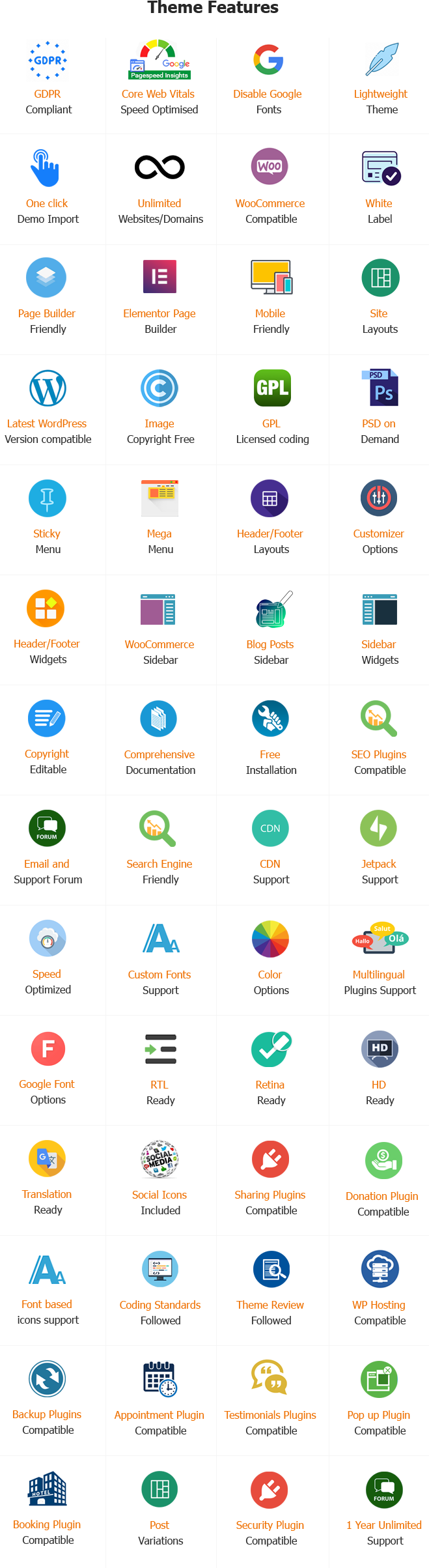
Unique features of a Mobile Friendly WordPress Theme
1. Fully Responsive Design
SKT Adaptive guarantees that your site looks and performs flawlessly on any device, whether phone or tablet. The responsive design automatically adjusts to the screen size, ensuring the best browsing experience on all platforms.
2. WooCommerce Mobile Friendly Integration
For companies looking to sell their products online, SKT Adaptive is fully compatible with WooCommerce, making it the ideal mobile-friendly eCommerce WordPress theme. It comes with all the tools you need to create and manage your online store, and features a layout that ensures your products are displayed stunningly on any device.
3. Mobile optimized for fast loading
This mobile friendly WordPress theme is designed using speed as a primary consideration. It’s optimized to load fast on mobile devices. This does more than enhance the user experience; it also assists with SEO rankings.
4. Mobile-First Design Approach
SKT Adaptive takes a mobile-first design approach, ensuring your site is optimized for the growing number of mobile users. The theme is designed to cater to mobile users while retaining a clean, attractive design compatible with any device.
5. Theme options that can be customized
With WordPress mobile-friendly theme options, it is easy to customize the layout, fonts, colors, and other design features to suit your personal branding. Whether you’re a beginner or an experienced user, the customization process is easy and painless.
6. One-Click Demo Import
Create your website in just a single click! SKT Adaptive includes demo content you can load quickly. This will allow you to get your website up and running quickly without spending time setting it up.
7. SEO optimized for mobile Devices
A mobile-friendly theme can only be as successful in terms of SEO as its desktop counterpart. SKT Adaptive includes built-in SEO optimization that helps your site rank highly in search results, especially for mobile searches.
8. Retina-Ready Display
Let your website’s photos appear clear and sharp on any device, including high-resolution displays, with the SKT Adaptive retina display. Your visitors will enjoy an immersive visual experience regardless of whether they use an ordinary or high-definition display.
9. Mobile-Friendly Contact Formulas
Contact forms are a must for every website as well. SKT Adaptive ensures that its designs are optimized for mobile users. Users can quickly reach us, whether on mobile or desktop.
10. Live Customizer with Real-Time Changes
The mobile friendly WordPress theme includes live customizers that let users see changes as you make them. This feature simplifies the customization process by allowing you to experiment with different styles and configurations in real time.
11. Multiple Pre-Built Layouts
SKT Adaptive provides several pre-designed home page layouts that can be easily modified. If you’re building a business website, blog, or even an eCommerce store, the template offers numerous layout options to suit various site types.
12. Drag-and-Drop Page Builder Compatibility
Customizing pages with SKT Adaptive is easy thanks to its compatibility with popular page builders like Elementor and WPBakery. Drag-and-drop builders let you build stunning, functional pages with no technical knowledge. This makes it simple to personalize your site.
13. Custom Widgets to Add Functions
This Mobile Friendly WordPress Theme has several custom widgets, including recent posts, popular posts, Twitter feeds, and more. These widgets can be used to provide helpful content to your site and increase the performance of your website.
14. Translation Complete
SKT Adaptive is translation-ready, enabling multilingual websites and reaching a larger audience. If you’re targeting people in the local area or around the world, the SEO optimized WordPress theme can be used in a variety of languages to enable simple localization.
15. Google Maps Integration
Incorporate Google Maps into your contact page or another relevant section of your website to help customers find your business’s physical address. This feature is ideal for companies with physical addresses.
16. Affordable and customizable Header and Footer
With the option to customize your header and footer, you can create each part of the site to fit your branding and requirements. It is possible to display important information, such as your company’s logo, contact information, and social media profiles.
17. Ongoing Theme Updates
Keep your site up to date with regular theme updates. SKT Adaptive provides timely updates to ensure compatibility with the latest WordPress versions, as well as security patches to keep your website safe and functional.
18. Comprehensive Support and documentation
Access to extensive instructions that will guide you through every step of using the premium WP theme. If you require assistance, SKT Adaptive also offers an expert support team to help with any technical questions or issues.
Benefits of Using a Mobile Friendly Theme
Here are the top advantages of using SKT Adaptive for your site:
Increased Mobile traffic:
With the growth in mobile device use, a mobile-friendly theme can help you attract more visitors on mobile devices. This results in increased interaction and traffic by mobile users.
Improved user experience:
Responsive design and quick load times create a pleasant experience that helps visitors stay on your site and discover more of your content and products.
Higher Conversion Rates:
An eCommerce WordPress theme, such as SKT Adaptive, ensures that your store’s website is user-friendly on mobile devices. This can result in a higher conversion rate and more sales.
Improved SEO (Search Engine Optimization) Rankings:
Google favors mobile-compatible sites in search results. When you use SKT Adaptive, you ensure your website is mobile-friendly, increasing your SEO rankings and visibility.
Cost-Effective Design:
Instead of hiring a developer to design a mobile-friendly website, SKT Adaptive provides a simple, cost-effective solution with user-friendly customization options.
Future-proofing Your Website:
As more people access websites on mobile devices, choosing a mobile friendly WordPress theme, such as SKT Adaptive, ensures your website stays current and valuable in the near future.
Why Is SKT Adaptive a Smart Choice for a Mobile Friendly WordPress Theme?
SKT Adaptive is among the most mobile friendly WordPress themes, offering the perfect blend of elegant design and top-quality performance. The theme is designed for mobile devices, meaning your site is mobile-responsive and user-friendly on any device. If you’re creating your own eCommerce shop or blog and website, SKT Adaptive gives you everything you need to make it a success online. The reasons why this mobile-friendly theme is a great option:
Responsive mobile design:
Using SKT adaptive technology, your site will automatically adapt to any screen size, from laptop monitors to smartphones, providing an easy and enjoyable experience for users.
Mobile-optimized for speed:
Not only does SKT Adaptive deliver a fluid design, but it’s also optimized to load quickly on mobile devices, enhancing the user experience and SEO performance.
Flexible Design:
Everything is customizable, without coding, so you can alter the appearance and feel of your website to fit your branding.
Final Thoughts
In the age of mobile, selecting the most mobile-friendly themes for your WordPress site is vital. SKT Adaptive is a standout for its extreme adaptability, responsiveness, and SEO optimization, making it ideal for all websites. No matter if you’re a blogger, company owner, or eCommerce website operator, this mobile friendly WordPress theme will ensure your website is beautiful and works effectively across all devices.
Download SKT Adaptive now and get started creating a mobile-friendly website that stands out from the rest! Visit SKT The Adaptive Mobile Friendly WordPress Theme to get started.
Same theme in Our Other SiteQuick links
Categories
- Real estate
- Author
- Automotive
- Bakery
- Blog
- Business
- Church
- Construction
- Corporate
- Dentist
- Divi Child
- Ebook
- Ecommerce
- Education
- Fastest
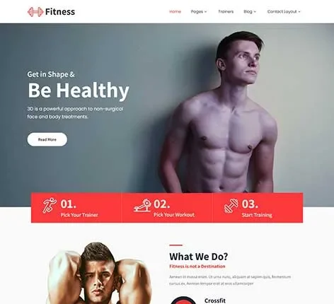
- Fitness
- Gutenberg
- Hotel
- Interior
- Lawyer
- Magazine
- Medical
- Multipurpose
- Music Artist
- Nature
- News
- NGO
- Non profit
- One Page
- Personal
- Photography
- Plugins
- Portfolio
- Resort
- Responsive
- Restaurant
- Spa and Salon
- Sports
- Technology
- Travel
- Wedding
© Copyright 2026 M/s. Shri Krishna Technologies